

Stock market communities: from Elon believers to russian lovers
Dive into emerging communities of social trading platform.

Hey there, Alex here, welcome to the first issue of the scrap'n'graph newsletter, if you are interested into scrapping and data visualisation, you should consider to subscribe! I’m also making twitter graph for fun on @alexduhem
The graph file (to open with gephi) is available at the end of this article
Context
Since a few month now, I'm digging into personal finance a little bit, which leads inevitably to stock market. I don't know much about it and I don't want to spend all my money into companies I don't even know (I have already lost money into crypto anyway).
For me, stock market is a jungle, and of course Google’s knows it, so since a few time now I'm ads-spammed by a social trading platform on Youtube : eToro.
When I hear “social”, my brain just say “ho yes probably data to scrap out there, what dataviz could I make out of it ?”
1. The scrapping part
eToro was quite easy to reverse engineer and scrap. If you log into their web app and browse a little bit, just open your favorite-browser dev tools, and you’ll quickly discover 3 handful endpoints:
1 request to get all (~4300) stock metadatas (stockId, name, etc) in JSON:
search traders requests which can be filtered by “riskscore”, performance, and tons of other filters with this kind of output. (useful tips : if you give it a wrong key, the search API gives you all the available filter )
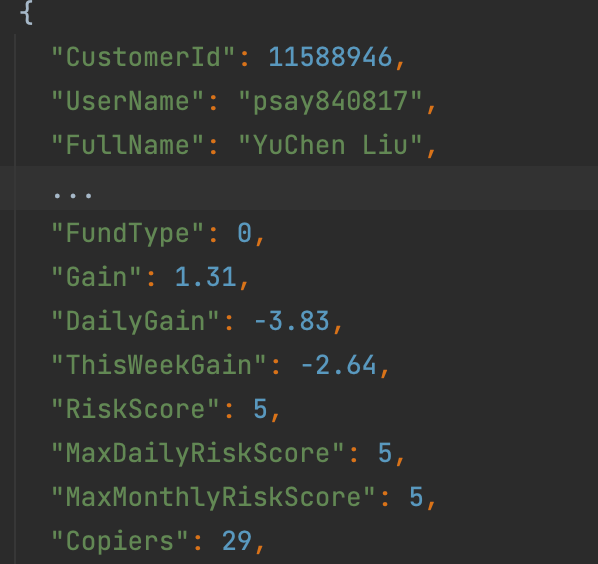
a endpoint to get the current portfolio of a trader with his CustomerId

These API is backed by Cloudfare, so it easier to use Puppeteer with Javascript (in a non-headless mode on my laptop) over python to avoid blocking for whatever reason (Cloudfare starts to be very clever to prevent scrapping). The API is also rate limited (~200 requests per ~5min I would say, I just used a VPN to avoid it.)
I won't go into to much of detail but at the end, the dataset includes ~40k traders, a lot of them don't have any trade, they just following/copy-trade other traders.
So it’s about ~40k requests, I prefer to do it on a relatively large timeframe, like 6 hours. The goal of scrapping is not to over charge the server of the target, even if ~40k requests is quite a small amount in the world of scrapping.
Edit: I discover just at the end of this article that eToro provide an API (yes, I scrap before even thinking of looking if there is an API..) but the endpoint I just give are more convenient for my use case.
2. The network graph
Disclaimer: the stock market moves a lot on a daily basis, the dataset dates from the beginning of May 2022, the network visualisation of this period can differ a lot from another in a another period, and you’ll see with the clustering algorithm that it tells a lot about the news.
High resolution and zoomable image here

Methodology
So here we are, with the help of Gephi and after some data cleaning (basically filtering traders without any position, stocks with only one position by one trader), this graph includes 14259 nodes (it's a bipartite graph, which means a node can be a trader, or a stock) and 196511 edges.
The size of the node are determined by its ‘in-degree’ topology, the more a node have inbounds edges, the bigger it is.
Edges are directed from traders to stocks, with a weight. The weight is basically the “invested” json field of the position, which means “what percentage of my capital this position represents?”, the bigger the weight, the more committed the trader is to that stock, the thicker the edge is draw on the graph. (and the more Force Atlas attract node between them)
Algorithms
The position of the nodes are computed by Force Atlas 2 algorithm (without going deep : “Nodes repulse each other like charged particles, while edges attract their nodes, like springs.”)
The colour of the nodes are determined by the clustering algorithm “modularity”.
What does that mean ? To simplify, the more nodes have common neighbour (the more stocks have the common traders), the more they will be close, the more they have probability to be in the same cluster.
Analysis
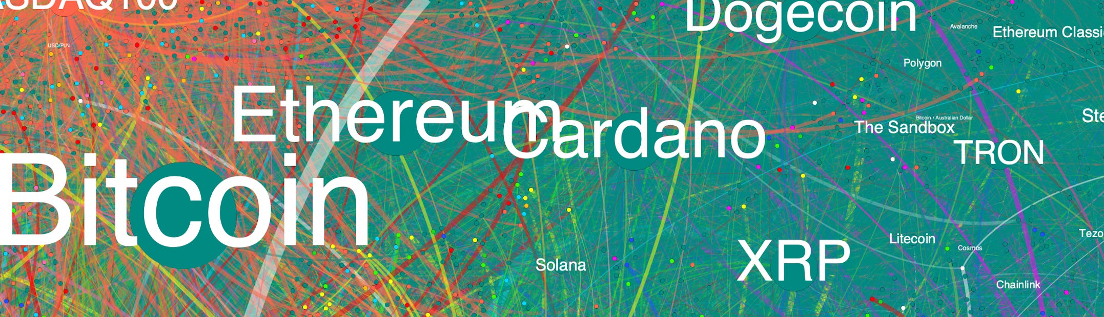
We can clearly identify 5 big communities, and 4 small ones:
dark green (top right): the more obvious one, really in crypto currency, we’ll call it crypto

orange (top) : we clearly identify typology of traders interested in index, currencies (forex), and commodities (oil, gold, copper, wheat), and that's one of the first thing I learned from this graph, on average, people who invest in index, are likely the same than the ones investing in currencies and commodities, I just don't know why. (example of popular investor from this cluster here, here, here and here). Note: a lot of people from there also invest in crypto, which explain the proximity of those 2 clusters. We'll call this community index
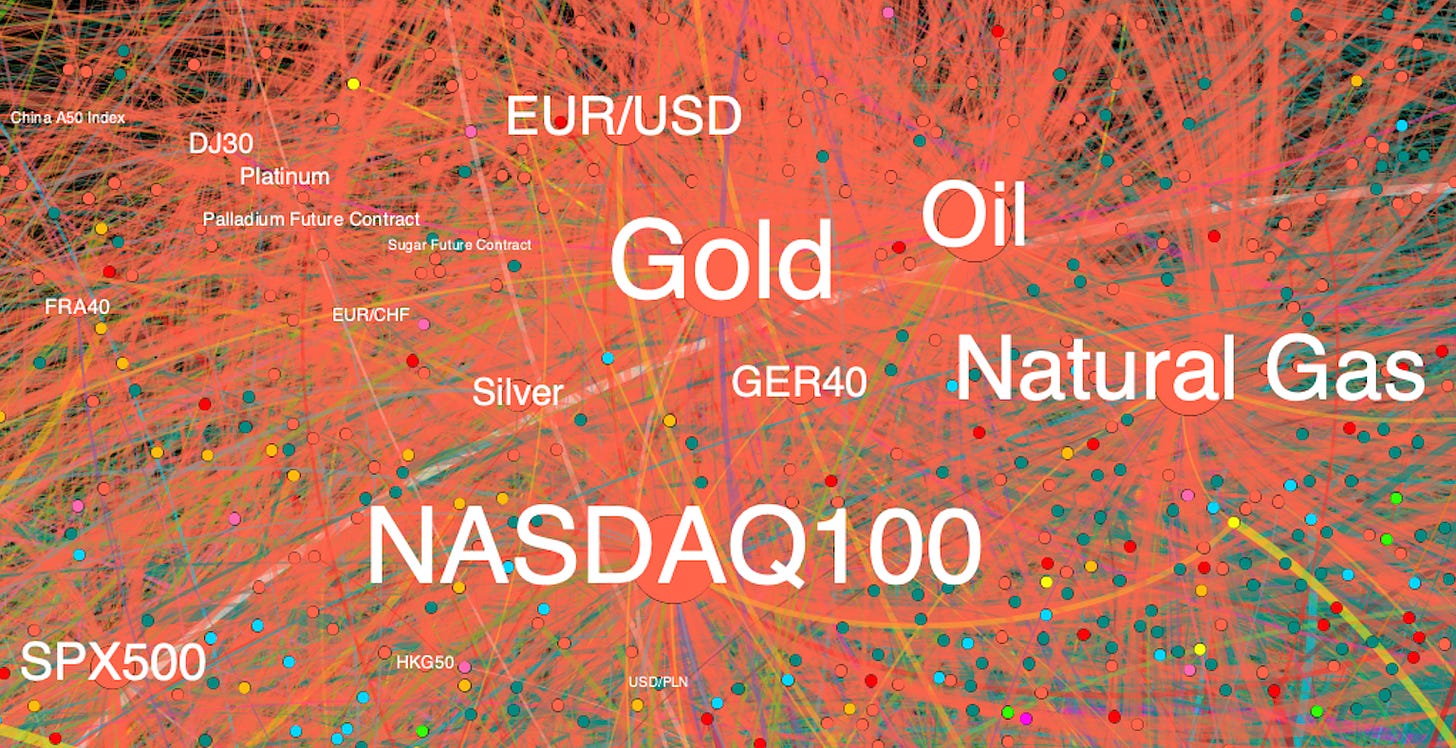
yellow (top left), people here are interested in ETF , Vanguard, iShares, Invesco (note that the tiny community in pink just at the right, also interested in ETF, but more like ProShare ETF)

dark blue (right): people here seems to be interested in pharmaceutical companies, biosciences, we’ll call it science

light blue and green (left and bottom): people here are interested into stocks, but I have to admit that I'm struggling to determine exactly what differentiate the 2 communities, there are quite tied between each other, but when I look deeper inside the light blue cluster, it seems that the company are more french/europeans ones, especially on the far left, and the green more from USA/China. This geographical hypothesis is obviously wrong for a lot a nodes, it’s more like a tendency than a truth on a node level. We’ll call them stock blue and stock green


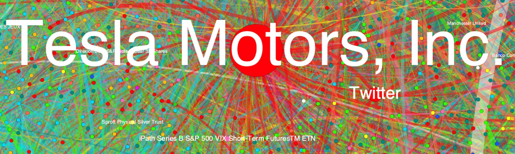
The 3 others tiny communities are, for me, the funniest ones:
The red one, the middle earth, the bridge between stocks and crypto, Tesla is almost a cluster in itself, or I would say Elon Musk. As you probably know, Twitter recently accepts its buyout offer, look how Tesla and Twitter are close! Note that MicroStrategy, a company strongly tied to crypto is also in this cluster. Let's call this community Elon
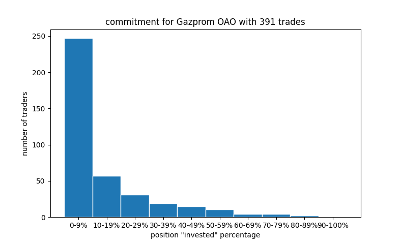
Light Yellow, the russian opportunities, as we say in French “le bonheur des uns fait le malheur des autres”. War in Ukraine means opportunities for cheeky people, that’s it. Companies in this cluster : Sberbank of Russia, Gazprom, Lukoil, PolyMetal International, Rosneft, Novatek and lot more Russia.

In pink (on the right): what it's called the meme stocks from Reddit, GameStop and AMC, I just discovered with this graph that there's still something with this companies, and then check google news afterwards. They apparently had a relatively big pump in march 2022, let's call it meme


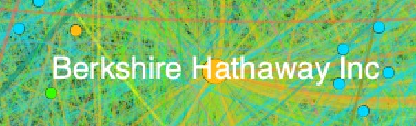
Funny thing is the well-known company of Warren Buffet / Charlie Munger, Berkshire Hathaway, is in between stocks and ETF, and the modularity clustering put it in the ETF community.
Questions I asked myself and and tried to answer with dataviz :
In this communities, people win or lose ?
Disclaimer for the following charts: it's a bad time on stock market right now, which means that the trader performance’s could be impact a lot recently.
The risk score is provided by eToro, here is an article which explain how they calculate it.


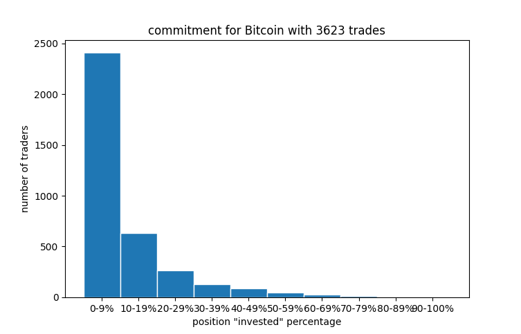
How traders are committed in their position in those different communities ?
reminder: the “invested” value is the percentage of the trader's worth. In the meme community, lot of people just put almost all their money in GameStop or AMC. I’m quite surprise by the index community by the way (but remember we also have Natural gaz and wheat in this community, impacted a lot by Ukraine War)

Let's look in detail some examples

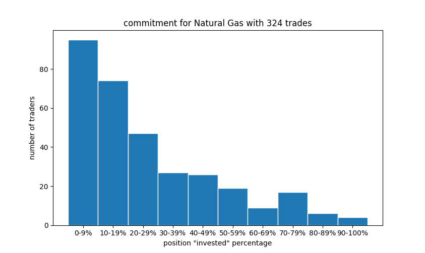

it’s just 49 trades for the wheat, not a big dataset to conclude something, but there is few people apparently believing in the future of baguette I guess.
What risk eToro give us for the discovered community ?

That’s all for me for this issue ! If you have any chart suggestion or any comments, just tell me :)
Tools I used:
puppeteer npm package
If you want to play with gephi, here is the .gephi file and the .gexf file
Bonus: you should click here